
Magazine Design: Tampa Bay’s Cigar City Magazine
Magazine design is one of the graphic design services that South Island Design offers. And the work we did for Cigar City Magazine is a great example of the scope of work that South Island Design can do for you. We started with creating an identity and designing a logo, designing and laying out the first three issues of the magazine, designing collateral marketing pieces and creating the website.
Logo Design for Magazine
Cigar City Magazine is the idea of Lisa Figueredo. She wanted to create a magazine that recognizes Tampa’s rich multicultural history with stories of “the good ole days”. Other than an idea of what this project was all about, we were pretty much starting from scratch. While that may sound like a graphic designer’s dream (no limitations!), the creative process doesn’t really work like that. It’s the rules and limitations that point you toward a solution.
![]()
The logo needed to be multifunctional. Not only did it need to be simple and recognizable (like most good logos), it also needed to work as a masthead for the magazine’s cover. We started by researching the typefaces on vintage cigar boxes and the signage in old photos of Ybor City. A lot of that lettering was too ornate and complicated with all of the outlines and flourishes. But we found Emporium had the right flavor without overdoing it.
We gave the text a wave effect, which is also common on cigar box art, and coupled it with the smaller words in Copperplate. Adding “Tampa Bay’s” was a late addition to the logo, but it actually improves the logo and the name. First it balances “Magazine”. It would look like something was missing without it. And not everybody knows that Tampa and Cigar City are the same place. So it helps make the connection that this is a history magazine about Tampa.
The Color Palette

The color palette was the natural result of looking through hundreds of old sepia tone photographs. The rich brown and cream match a lot of the artwork that appears in the magazine. I could say the brick red was obviously inspired by the brick streets that run through the historic parts of Tampa and Ybor City. But it doesn’t. Nope. It comes from needing an appropriate color that will jump off of the pages and grab your attention.
Magazine Graphic Design
South Island Design helped launch Cigar City Magazine by designing and laying out the first three issues of the magazine. This established the look of the publication and made it easier for their own artists to take over and continue with the graphic design.
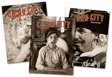
The magazine’s cover needed the most attention since that’s often the deciding factor for someone picking it up and taking it home or leaving it on the newsstand. Big, captivating photographs of people were used to draw readers in. Your eyes tend to gravitate toward faces more than scenery or objects.
The magazine isn’t another Tampa lifestyle tabloid. So the descriptive text on the cover was set fairly small in Goudy. We wanted to respect the photography and not overlay it with loud words. Goudy is a very readable old-style serif typeface. A more modern san serif typeface would look out of place in a history magazine.
Magazine Website Design
Tampa Bay’s Cigar City Magazine is on the second version of its website. The first website was designed to launch the magazine and give readers and advertisers a taste. The second version, launched in 2010, was designed to publish magazine content online and to increase exposure and readership.
It can be beneficial to use one design company for your graphic design and website design needs. The design company will have a better understanding of all of your marketing goals and how they relate to one another.
Having worked on the initial design of Cigar City Magazine’s identity, the design of the website was fairly straightforward. The layout was a balancing act of trying to present lots of text in the most readable format and giving it a little bit of a vintage feel. These days most websites with news have a white background and a hierarchy of more important and less important articles. This is designed for easy reading and best usability. We wanted to take some of those best practices, but give it a little more warmth and personality.
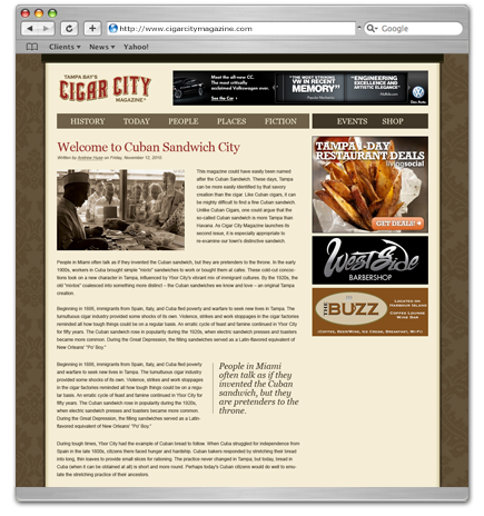
By using a CMS (content management system) the staff at Cigar City Magazine can post new content at their own convenience. We used Yoo Theme’s Zoo Blog to organize all of the articles and allow sharing and commenting. Flex Banner, another component, was added to manage the banner ads in the header and right sidebar.
Your Magazine Graphic Design and Website Design in One Place
If you’re launching a new product or service, it can be beneficial to use one design company for your graphic design and website design needs. Not only will you save time and streamline the work flow, but the design company will have a better understanding of all of your marketing goals and how they relate to one another.
If you’d like to talk to us about launching your brand, contact us. ![]()