
Organic Logo Design for HumiVerde
Humiverde came to South Island Design for help in creating an organic logo design, a custom website and marketing materials for the product’s launch. HumiVerde is a new company that offers a product line of organic fertilizers. They’ve created a secret blend of humic acids, fulvic acids, microbes and such to create a jugful of eco-friendly goodness that improves crop growth, reduces the need for water and pesticides, and saves growers money
One of the benefits of using a single graphic design company is that there will be brand consistency across all marketing materials. Check out the examples below to see how the brand was developed for the letterhead, business cards, website, product labels and brochures.
The Color Palette for Organic Logo Design
Janet Dougherty, president of HumiVerde, already had a good idea of what she wanted for the logo and color palette. So it was just a matter of South Island Design fine-tuning it to give it balance and energy.
The green was selected, of course, because it’s the color of nature and growth. And the purple was selected for maximum color contrast. While a red would be the complementary color for green, it can often be too harsh of a contrast.

The logo’s typeface is Pooper Black. Its bold, casual strokes are very readable for product packaging. And it’s perfect for HumiVerde because it’s progressive and energetic.
Adding the leaf and the swoop to the “i” was a simple way to show the concept of plant growth. Too often in logo design you’ll see the company trying to tell their entire story in the logo. But it’s not necessary. A good logo design should be a unique and memorable reflection of the company.
![]()
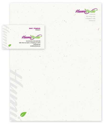
Business Card & Letterhead Design
Part of HumiVerde’s visual identity is the speckled paper, True White from French Paper Co.‘s Speckletone Line. It shows up most prominently on the business card and letterhead design, as well as where it’s appropriate on other marketing collateral. Since HumiVerde is all about products “from the Earth, for the Earth”, it makes sense for their printed communications to reflect that with earthy, recycled paper. The texture is subtle enough not to be distracting or reduce readability, but noticeable enough to add an extra layer of interest to the stationery design.
Organic Website Design & Development
HumiVerde.com, like most of the websites we currently develop, is built using a content management system. This allows our clients to make edits to the content without having to know much about programming, source code and web development.
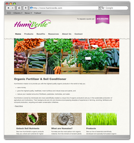
HumiVerde’s website was designed for simplicity and action. You can go into great depth explaining exactly what humates and microbes are and what they can do for your crops. So knowing that there could be lengthy pages throughout the site, we wanted to make it as easy to read as possible. Content floats on the page and isn’t boxed in. Headlines are bold and content text is large enough and spaced enough to be very readable.
On just about every page you’ll find two purple banners on the right side. This is the call to action. This is the number one thing HumiVerde wants people on the site to be looking at. Other than the logo, the banners are the only purple things on the page. That makes them stand out. But since the purple is part of the brand identity, it still matches.
Product Label Design
HumiVerde products won’t be appearing in retail stores, at least in the short term. But we wanted the gallon jugs to look like they could with a clean design and eye-catching photography.
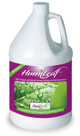
The mostly purple label will visually stand out from the competition. And while each of HumiVerde’s products uses the purple background, they are easily distinguished by separate photographs that reinforce the product’s use.
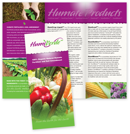
Collateral Design
Designing the printed marketing material was simply an extension of following the established brand identity. You’ll again see large areas of purple, the speckled paper background and eye-catching photographs of fruits, vegetables and flowers.
HumiVerde launched in 2012 with a strong brand identity. By taking the time to establish the visual identity prior to launch, they’ve made it easier to create any future marketing materials. Everything just needs to follow the design guidelines already established with the existing website, product labels, and brochure. ![]()